
A bundle builder should look like your store.
Choose a complete destination page or a section that drops into the layout you already have. Every detail page is grounded in the current Liquid schema.
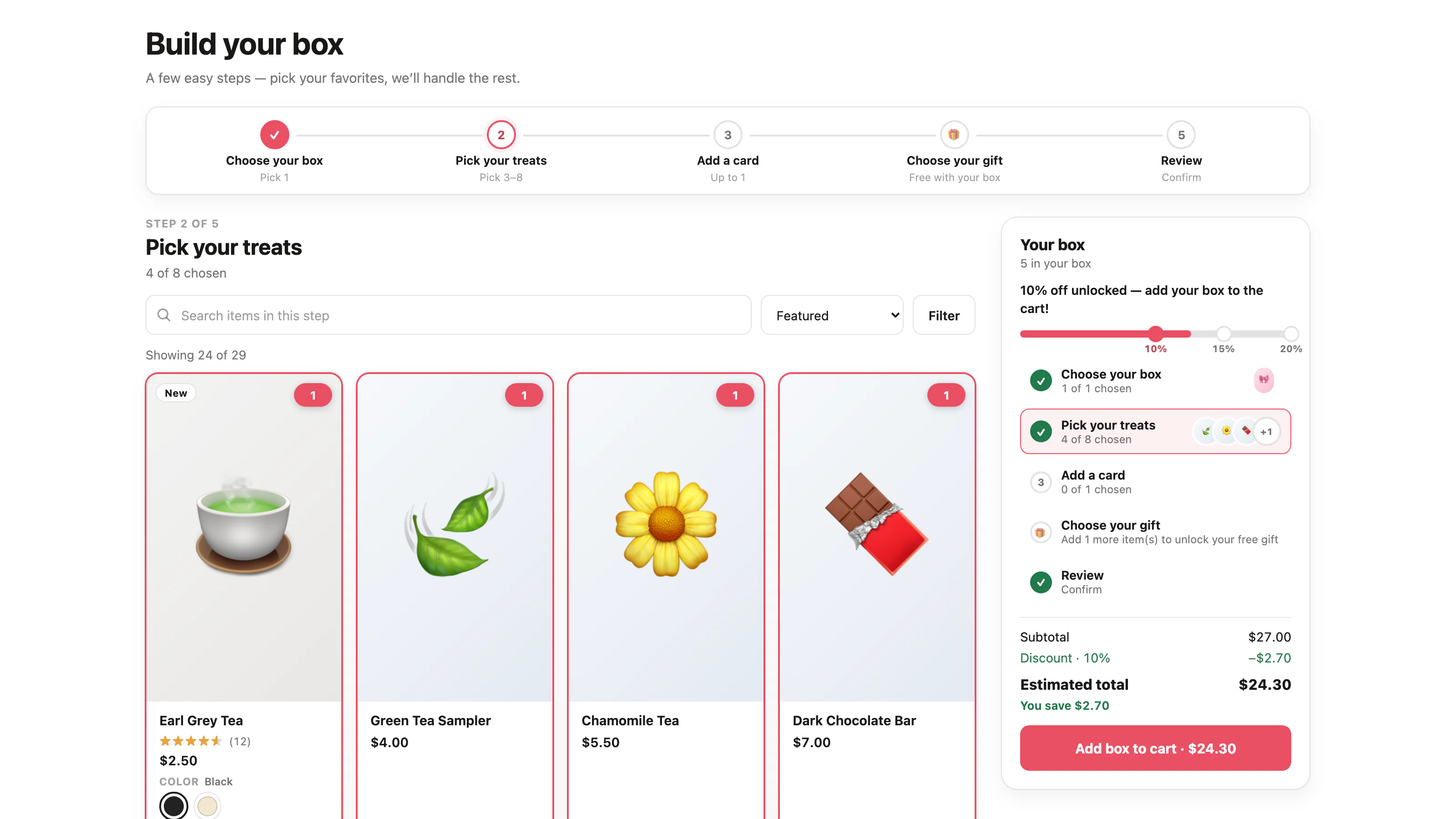
Studio
The recommended guided box builder, with campaign-led steps, catalog search and filters, a live summary, and a final review.
Open the live settings demo →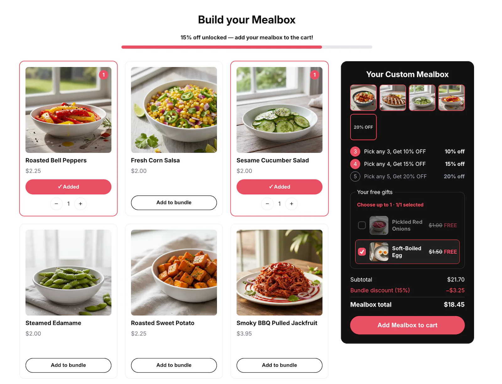
Primary
The classic one-page builder with reorderable slots, catalog tools, quick view, real swatches, optional gift-first cards, and a header-aware sticky summary.
Open the live settings demo →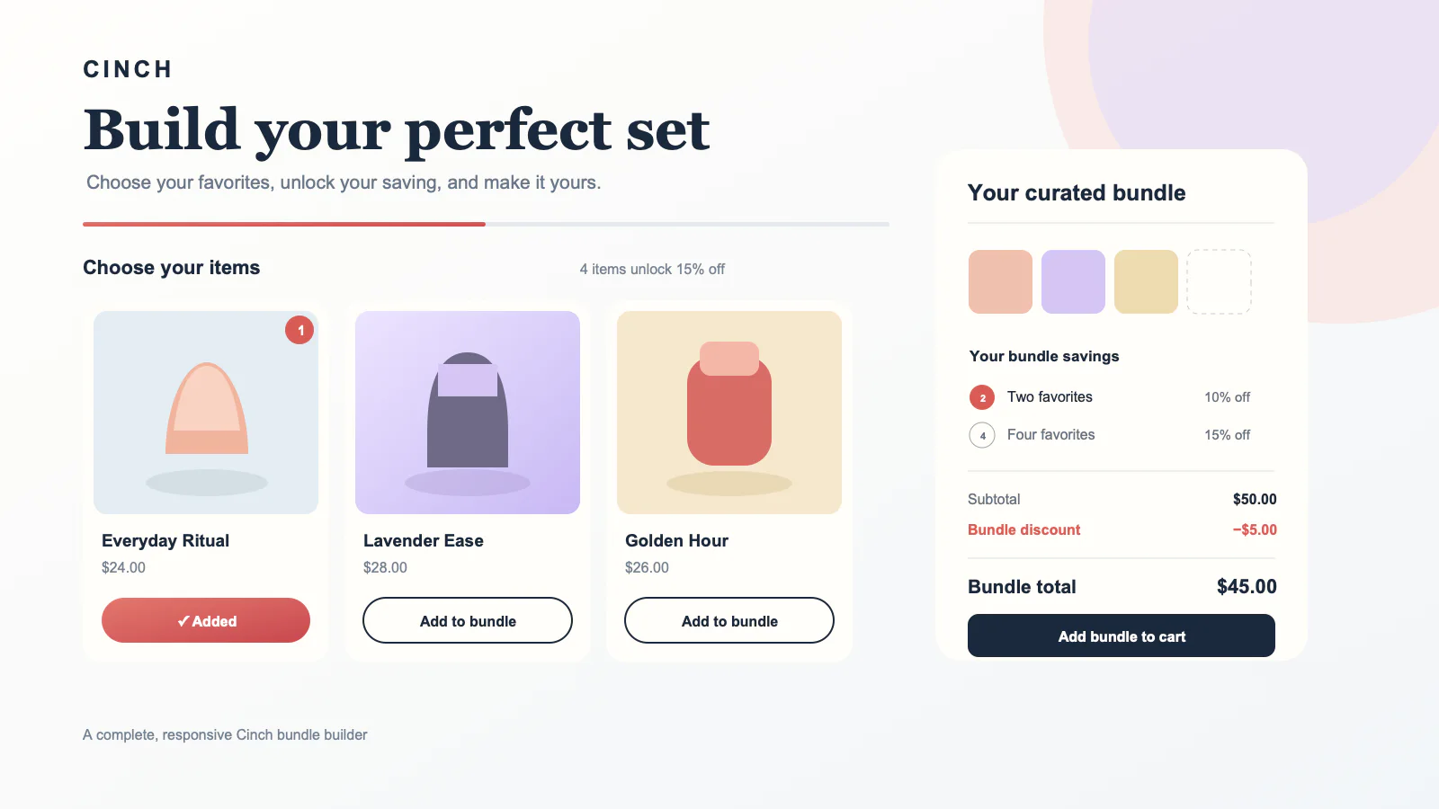
Editorial
A warm full-page builder with spacious cards, real swatches, optional gift-first cards, and a header-aware editorial summary.
Open the live settings demo →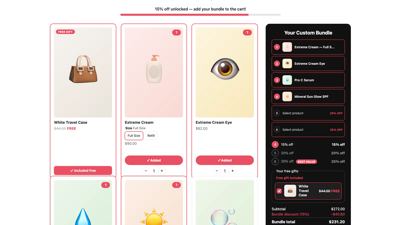
Boutique
A beauty-counter full-page builder with real swatches, numbered slots, gifts leading the grid, and a folding mobile summary.
Open the live settings demo →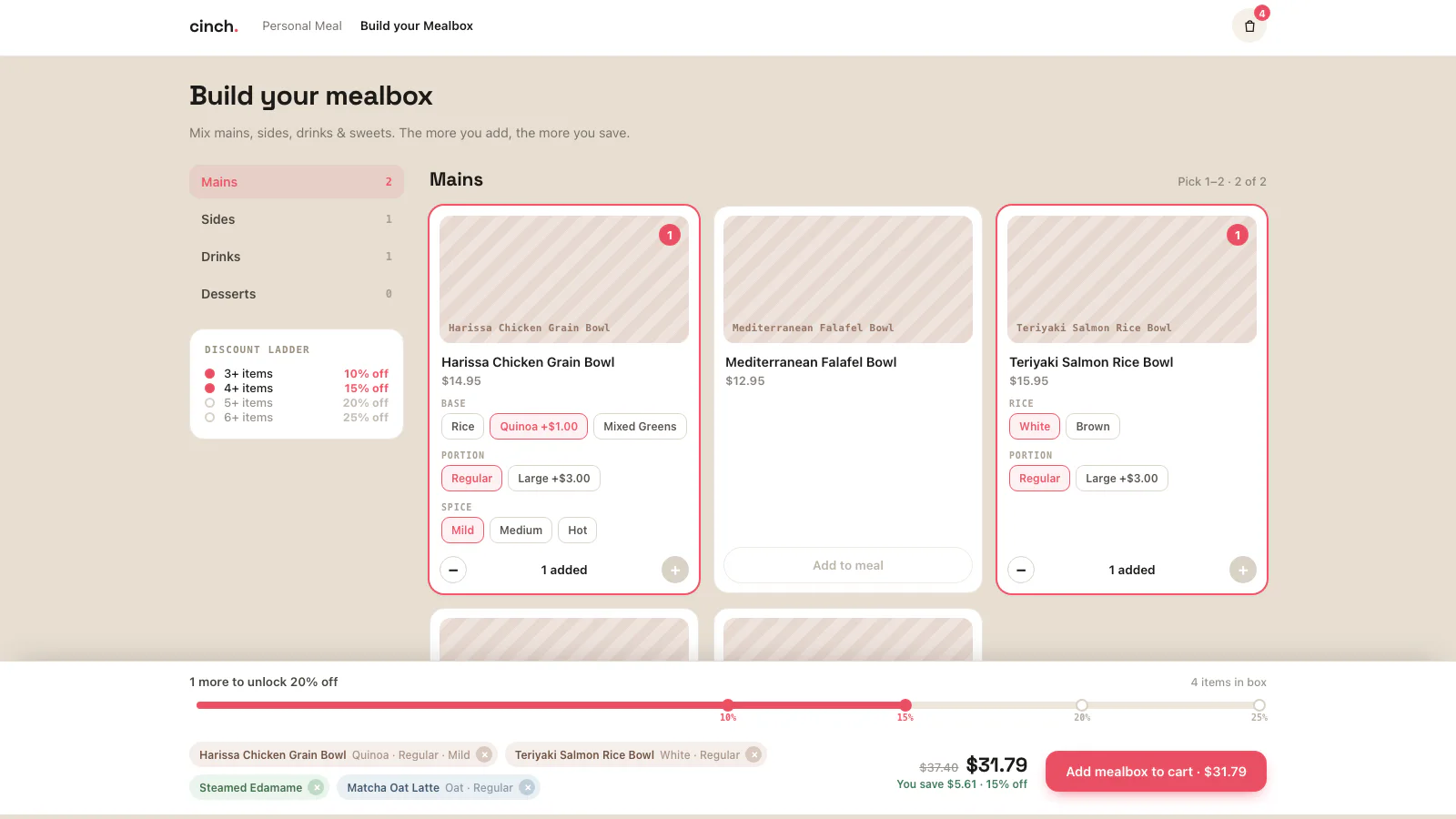
Guided
A category-led full-page builder whose rail or step flow uses real swatches and a selection tray that folds into a capped mobile sheet.
Open the live settings demo →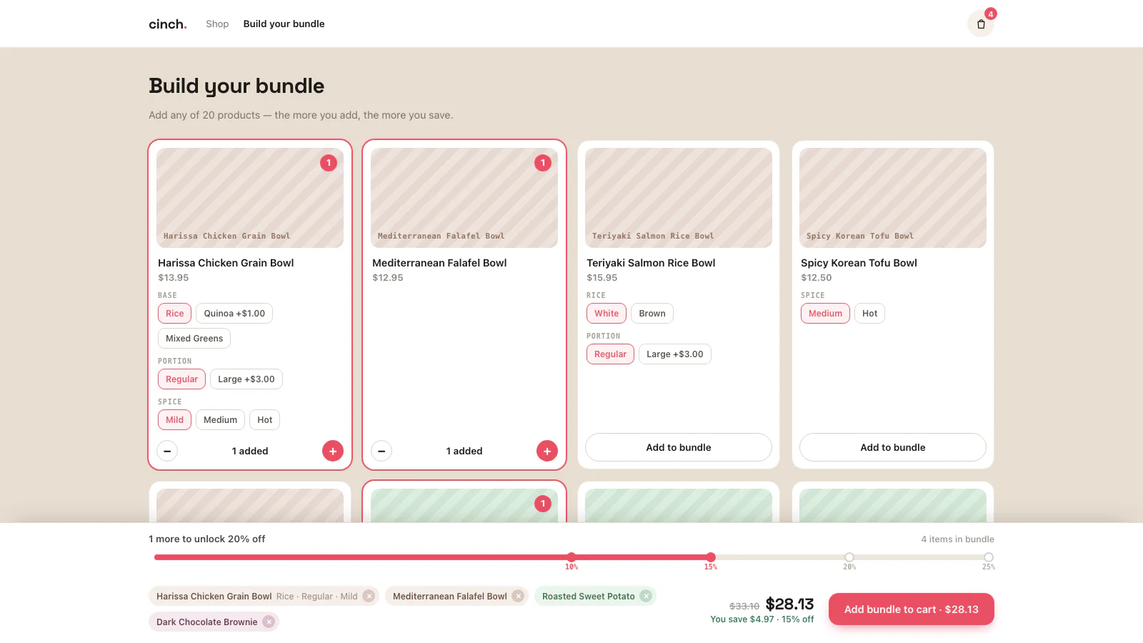
Showcase
An open grid with real swatches, optional gift-first cards, and a summary that stays slim on desktop and folds on mobile.
Open the live settings demo →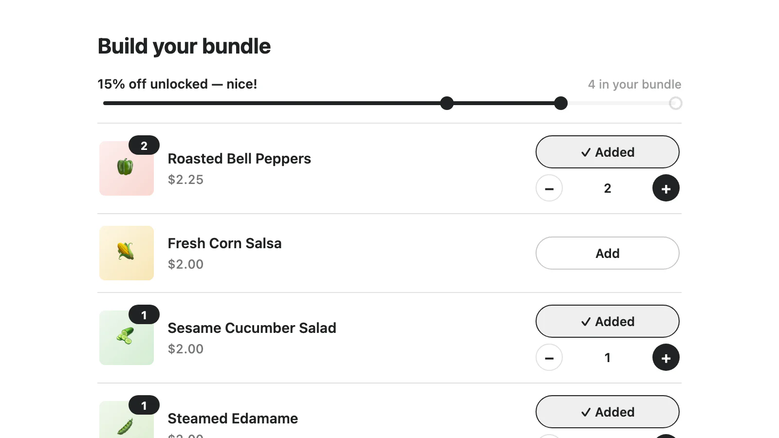
Minimal
A restrained list-or-grid section with real swatches, optional quick view, configurable image fit, and gift-first merchandising.
Open the live settings demo →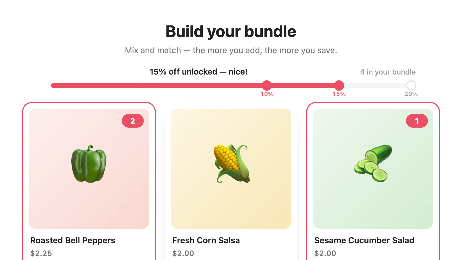
Card grid
A responsive card grid with real swatches, configurable image fit, optional quick view, and gift-first merchandising.
Open the live settings demo →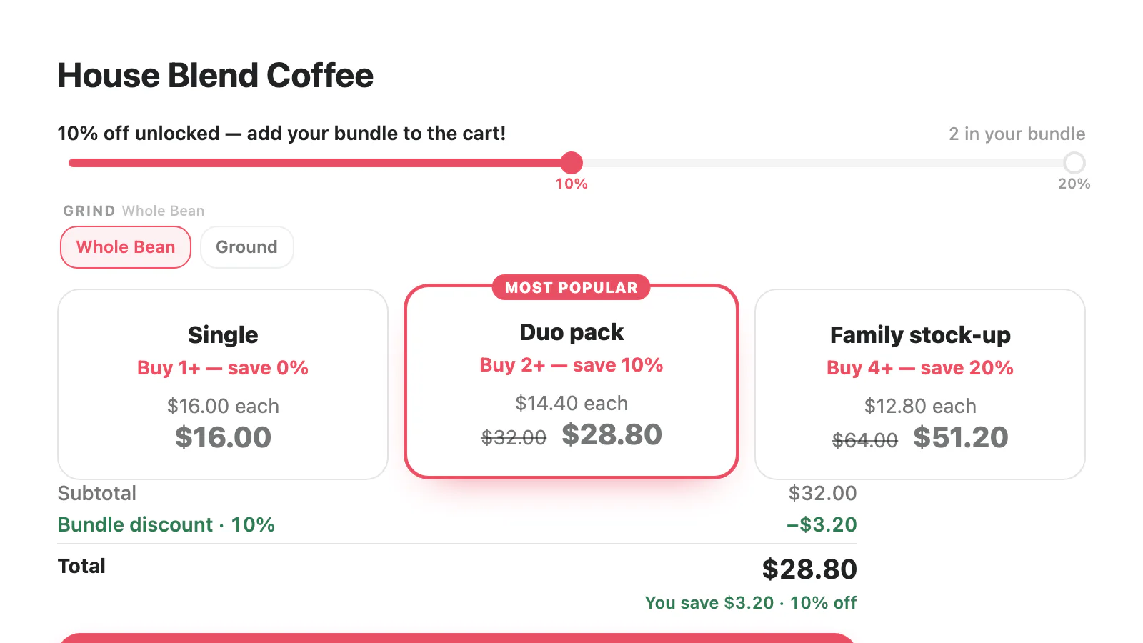
Quantity breaks
A volume-focused ladder with stacked or column steps, configurable image fit, real variant swatches, and optional per-unit pricing.
Open the live settings demo →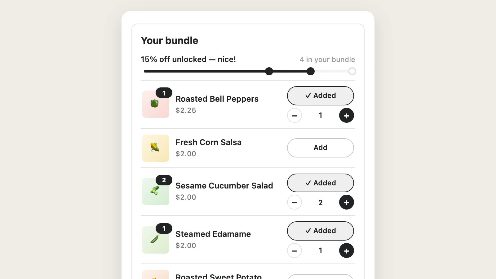
Compact
A polished narrow-placement section with configurable image fit, real swatches that collapse after six choices, and low-chrome rows.
Open the live settings demo →Six Theme Editor surfaces for the standard path.
App blocks are the simplest no-theme-write setup. Theme setup can open the product editor with the Bundle block ready in the main section. These blocks use a different renderer from the ten committed design files.
Product bundle
Theme app block for rendering the shared bundle widget on a product template.
Collection bundle
Theme app block for rendering the shared bundle widget on a collection template.
Landing-page bundle
Theme app block for rendering the shared bundle widget on a landing or custom page.
Cart progress
Display-only cart progress surface with reward, away, unlocked, color, track, height, and optional campaign settings.
Cart bundle message
Pure-Liquid cart summary for grouped bundle lines with an optional edit link.
Headless core
Custom-page embed surface for the headless bundle engine.