
Card grid
A responsive card grid with real swatches, configurable image fit, optional quick view, and gift-first merchandising.
Built for: Build-a-box and mix-and-match campaigns with visual products.
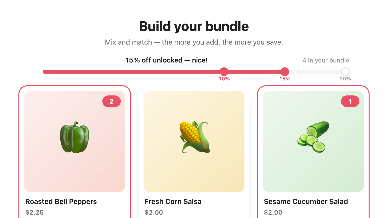
Use the controls merchants actually get.
The catalog data is illustrative. Every configurable section and block setting, plus each folded variant, is synced from the committed Liquid schema.
How Card grid handles each offer.
The four campaign tabs in the demo show one illustrative state per supported builder mode, including selectable, preselected, and locked gift states. Fixed bundles use a standard product page and expand at checkout.
| Campaign state | Rendering in this design |
|---|---|
| Custom bundle | Product selection, progress, qualifying step, totals, and add-to-cart. |
| Build-a-box sections | Named groups and live section counts within the shared storefront payload. |
| Quantity breaks | Compatible rendering through the design’s product and step UI. |
| Free gifts | Selectable, preselected, and locked gift states; locked gifts can render as Included free. |
| Fixed bundle | Not applicable. Shoppers buy the fixed parent product through its standard product form. |
The schema, rendered without drift.
103 settings across the section and its reorderable blocks.
| Group | Setting | Type | Options | Default | What it changes |
|---|---|---|---|---|---|
| Section | Campaign ID (optional) | text | — | Theme default | Leave empty on product and collection pages — the section finds the campaign targeting the page. Set an ID (cmp-…) to always show one campaign. IDs appear in the app's campaign editor URL and Diagnostics page. |
| Section | Heading | text | — | Build your bundle | Controls this part of the section in the Theme Editor. |
| Section | Subheading | text | — | Mix and match — the more you add, the more you save. | Controls this part of the section in the Theme Editor. |
| Section | Accent color | color | — | #e94f64 | Controls this part of the section in the Theme Editor. |
| Section | Gift accent color | color | — | #b8863b | Controls this part of the section in the Theme Editor. |
| Section | Text color | color | — | Theme default | Leave empty to inherit the theme text color. |
| Section | Card background | color | — | #ffffff | Controls this part of the section in the Theme Editor. |
| Section | Image fit | select | Cover (crop to fill), Contain (show whole product) | cover | Cover fills the shape and crops edges; Contain shows the whole product without cropping. |
| Section | Section background | color | — | Theme default | Leave empty to inherit the theme background. |
| Section | Corner style | select | Rounded, Soft, Square | rounded | Controls this part of the section in the Theme Editor. |
| Section | Show discount labels on the progress track | checkbox | — | On | Controls this part of the section in the Theme Editor. |
| Section | Limit content width | checkbox | — | On | Controls this part of the section in the Theme Editor. |
| Section | Content width | range | — | 1200 | Controls this part of the section in the Theme Editor. |
| Section | Variant options | select | Color swatches and buttons, Buttons, Dropdowns | swatches | Products with multiple options show one row per option, such as Color and Size. |
| Section | Swap button on full single-choice categories | text | — | Choose this instead | Controls this part of the section in the Theme Editor. |
| Message bar | Show progress track | checkbox | — | On | Controls this part of the section in the Theme Editor. |
| Message bar | Empty state | text | — | Add your first product to start saving | Controls this part of the section in the Theme Editor. |
| Message bar | Progress ({remaining}, {label}, {discount}) | text | — | Add {remaining} more to unlock {discount}% off | Controls this part of the section in the Theme Editor. |
| Message bar | Gift prompt | text | — | Nice! Choose your free gifts below | Controls this part of the section in the Theme Editor. |
| Message bar | Ready ({discount}) | text | — | {discount}% off unlocked — add your bundle to the cart! | Controls this part of the section in the Theme Editor. |
| Message bar | Adding | text | — | Adding your bundle… | Controls this part of the section in the Theme Editor. |
| Message bar | Added | text | — | Your bundle is in the cart 🎉 | Controls this part of the section in the Theme Editor. |
| Message bar | Over largest bundle | text | — | You’ve exceeded the largest bundle size — remove some items | Controls this part of the section in the Theme Editor. |
| Message bar | Category below minimum ({remaining}, {label}) | text | — | Add {remaining} more to {label} | Controls this part of the section in the Theme Editor. |
| Message bar | Items count ({count}) | text | — | {count} in your bundle | Controls this part of the section in the Theme Editor. |
| Message bar | Editing a carted bundle | text | — | You’re editing a bundle from your cart — updating replaces it. | Controls this part of the section in the Theme Editor. |
| Message bar | Editing: unavailable items ({dropped}) | text | — | Heads up: {dropped} item(s) from your original bundle are no longer available and won’t be included. | Controls this part of the section in the Theme Editor. |
| Message bar | paragraph | — | Theme default | Controls this part of the section in the Theme Editor. | |
| Countdown timer | paragraph | — | Theme default | Controls this part of the section in the Theme Editor. | |
| Countdown timer | Label | text | — | Ends in | Controls this part of the section in the Theme Editor. |
| Countdown timer | Ended text | text | — | Offer ended | Controls this part of the section in the Theme Editor. |
| Products | paragraph | — | Theme default | Controls this part of the section in the Theme Editor. | |
| Products | Card style | select | Raised — soft shadow, Outline — hairline border, Flat — tinted, chromeless | raised | Controls this part of the section in the Theme Editor. |
| Products | Image shape | select | Square, Landscape, Portrait | square | Controls this part of the section in the Theme Editor. |
| Products | Card size | range | — | 220 | The grid fits as many cards as the space allows. |
| Products | Show products from | collection | — | Theme default | Optional. Shows this collection's products in the collection's order, and each card can use the product's full details. Products also need to be in the published campaign to appear. Leave empty to show the campaign's products. |
| Products | Add button label | text | — | Add to bundle | Controls this part of the section in the Theme Editor. |
| Products | Added button label | text | — | Added | Controls this part of the section in the Theme Editor. |
| Products | Show product badges | checkbox | — | Off | Short labels like New or Refillable, from the badges saved on each product. Gift cards keep their gift badge instead. |
| Products | Show review stars | checkbox | — | Off | Uses the rating your reviews app saves on each product. |
| Products | Review count suffix | text | — | Theme default | Shown after the number, e.g. (128 Reviews). Leave empty to show only the number. |
| Products | Per-product limit note ({max}) | text | — | Limit {max} per product | Controls this part of the section in the Theme Editor. |
| Products | Sold-out products | select | Hide them, Show them grayed out | hide | Controls this part of the section in the Theme Editor. |
| Products | Sold out label | text | — | Sold out | Controls this part of the section in the Theme Editor. |
| Products | paragraph | — | Theme default | Controls this part of the section in the Theme Editor. | |
| Products | Show the toolbar from | range | — | 9 | Controls this part of the section in the Theme Editor. |
| Products | Search | checkbox | — | On | Controls this part of the section in the Theme Editor. |
| Products | Search placeholder | text | — | Search products | Controls this part of the section in the Theme Editor. |
| Products | Sorting | checkbox | — | On | Controls this part of the section in the Theme Editor. |
| Products | Sort: featured | text | — | Featured | Controls this part of the section in the Theme Editor. |
| Products | Sort: price up | text | — | Price: low to high | Controls this part of the section in the Theme Editor. |
| Products | Sort: price down | text | — | Price: high to low | Controls this part of the section in the Theme Editor. |
| Products | Sort: title A–Z | text | — | Title: A to Z | Controls this part of the section in the Theme Editor. |
| Products | Sort: title Z–A | text | — | Title: Z to A | Controls this part of the section in the Theme Editor. |
| Products | Filters | checkbox | — | On | Filter chips are built from each product's options (like Color or Size) and the grid's price range. |
| Products | Filter button label | text | — | Filter | Controls this part of the section in the Theme Editor. |
| Products | Load products in pages | checkbox | — | On | Controls this part of the section in the Theme Editor. |
| Products | Products per page | range | — | 24 | Controls this part of the section in the Theme Editor. |
| Products | Load more button ({count}) | text | — | Show more ({count} left) | Controls this part of the section in the Theme Editor. |
| Products | Result count ({count}) | text | — | {count} products | Controls this part of the section in the Theme Editor. |
| Products | Result count, paged ({shown}, {count}) | text | — | Showing {shown} of {count} | Controls this part of the section in the Theme Editor. |
| Products | No results heading | text | — | No products found | Controls this part of the section in the Theme Editor. |
| Products | No results hint | text | — | Try a different search or clear the filters. | Controls this part of the section in the Theme Editor. |
| Products | Clear filters label | text | — | Clear all filters | Controls this part of the section in the Theme Editor. |
| Products | Selected items hidden note ({count}) | text | — | {count} selected item(s) are not shown right now. | Controls this part of the section in the Theme Editor. |
| Products | Show hidden items button | text | — | Show them | Controls this part of the section in the Theme Editor. |
| Products | Price filter label | text | — | Price | Controls this part of the section in the Theme Editor. |
| Products | Price filter: under ({price}) | text | — | Under {price} | Controls this part of the section in the Theme Editor. |
| Products | Price filter: over ({price}) | text | — | Over {price} | Controls this part of the section in the Theme Editor. |
| Products | Show free gifts as the first cards | checkbox | — | Off | Gift cards show the gift's regular price crossed out. The bundle rules still decide when the gift is included. |
| Products | Gift card badge | text | — | Free gift | Controls this part of the section in the Theme Editor. |
| Products | Gift status before it's earned | text | — | Yours free with this bundle | Controls this part of the section in the Theme Editor. |
| Products | Gift status once included | text | — | ✓ Included free | Controls this part of the section in the Theme Editor. |
| Products | Show a quick view | checkbox | — | Off | Clicking a product photo opens a detail window. |
| Products | Photo hover label | text | — | Quick view | Controls this part of the section in the Theme Editor. |
| Products | Show the price | checkbox | — | On | Controls this part of the section in the Theme Editor. |
| Products | Show review stars | checkbox | — | On | Controls this part of the section in the Theme Editor. |
| Products | Show badges as checkmarks | checkbox | — | On | The product's badges, listed like feature checkmarks. |
| Products | Show the description | checkbox | — | On | Loads the product's own description when the window opens. |
| Products | Description length | select | Short, Medium, Long | medium | Controls this part of the section in the Theme Editor. |
| Products | Show an add button | checkbox | — | On | Controls this part of the section in the Theme Editor. |
| Products | Add button label | text | — | Add to bundle | Controls this part of the section in the Theme Editor. |
| Products | Added button label | text | — | ✓ Added | Controls this part of the section in the Theme Editor. |
| Products | Link to the product page | checkbox | — | On | Controls this part of the section in the Theme Editor. |
| Products | Product page link label | text | — | View full details | Controls this part of the section in the Theme Editor. |
| Products | Category status ({label}, {count}, {max}) | text | — | {label}: {count} of {max} | Controls this part of the section in the Theme Editor. |
| Products | Category status, no max ({label}, {count}, {min}) | text | — | {label}: {count} selected — pick at least {min} | Controls this part of the section in the Theme Editor. |
| Products | Category status, optional ({count}) | text | — | {count} chosen | Controls this part of the section in the Theme Editor. |
| Products | Tier deal ({min}, {discount}) | text | — | Buy {min}+ — save {discount}% | Controls this part of the section in the Theme Editor. |
| Products | Per-unit price ({price}) | text | — | {price} each | Controls this part of the section in the Theme Editor. |
| Free gifts | paragraph | — | Theme default | Controls this part of the section in the Theme Editor. | |
| Free gifts | Heading | text | — | 🎁 Free gift unlocked | Controls this part of the section in the Theme Editor. |
| Free gifts | Guaranteed-gift label | text | — | Included free | Shown on a preselected gift the customer can't change. |
| Totals | Subtotal label | text | — | Subtotal | Controls this part of the section in the Theme Editor. |
| Totals | Discount label | text | — | Bundle discount | Controls this part of the section in the Theme Editor. |
| Totals | Total label | text | — | Total | Controls this part of the section in the Theme Editor. |
| Totals | Savings line ({amount}, {discount}) | text | — | You save {amount} · {discount}% off | Controls this part of the section in the Theme Editor. |
| Add to cart | Button label | text | — | Add bundle to cart | Controls this part of the section in the Theme Editor. |
| Add to cart | Show the total on the button | checkbox | — | On | Controls this part of the section in the Theme Editor. |
| Add to cart | Button label while editing a carted bundle | text | — | Update bundle | Controls this part of the section in the Theme Editor. |
| Add to cart | Updated message | text | — | Your bundle is updated 🎉 | Controls this part of the section in the Theme Editor. |
| Add to cart | Show error messages | checkbox | — | On | Controls this part of the section in the Theme Editor. |
| Add to cart | Open the cart after adding | checkbox | — | On | Opens your theme's cart drawer when the bundle is added. Themes that don't support this ignore it. |
Your words stay in the theme.
Generic storefront wording is theme-owned. The campaign keeps only the cart title and each step’s message and badge.
Section · HeadingBuild your bundle
Build your summer set
Editable in this design
- Campaign ID (optional)Section
- HeadingSection
- SubheadingSection
- Swap button on full single-choice categoriesSection
- Empty stateMessage bar
- Progress ({remaining}, {label}, {discount})Message bar
- Gift promptMessage bar
- Ready ({discount})Message bar
- AddingMessage bar
- AddedMessage bar
- Over largest bundleMessage bar
- Category below minimum ({remaining}, {label})Message bar
Keep what earns its place.
Removing a block removes that presentation layer, not the checkout rule. Shopify still validates the price.
Message bar
Removes the progress, ready, and status message area.
Countdown timer
Removes the schedule-bound countdown from this design.
Products
Removes the product or quantity selection surface.
Free gifts
Removes the dedicated free-gift presentation area.
Totals
Removes the illustrative subtotal, savings, and total display.
Add to cart
Removes the design’s add-bundle button.
Pick the least complicated path that fits.
Theme app block
The standard no-theme-write route. It uses the app-block renderer rather than installing this committed design file.
One-click is gated
This path stays hidden in production until the protected theme-write capability is available.
Manual install
Copy the self-contained section and place it in a compatible theme template.
Change the presentation without changing the pricing authority.
The theme renders the campaign, the storefront engine owns selection and cart intent, and Shopify checkout validates the result.
Three layers, one direction
- Theme and published Shopify data
- Selection and cart engine
- Shopify checkout pricing